Learn UX Design: Beginner Figma Tips, Mobile UX & Portfolio Best Practices - Vimal Bhatt
By: Vimal Bhatt

In today’s tech-driven world, users expect things to just work. The best interfaces, for them, are those interfaces which feel almost effortless, ones which turn complex processes into simple steps.
In this guide, you’ll learn key UX design principles, Figma tips, and practical strategies to design better user experiences while building a strong foundation as a designer.
Introduction
User Experience(UX) design refers to the process of creating products that are easy to use, intuitive, and effective. It focuses on how users interact with a product, whether they can navigate it easily, complete tasks without confusion, and achieve their goal. UX is less about how something looks, and more about how well it works, and how natural it feels.
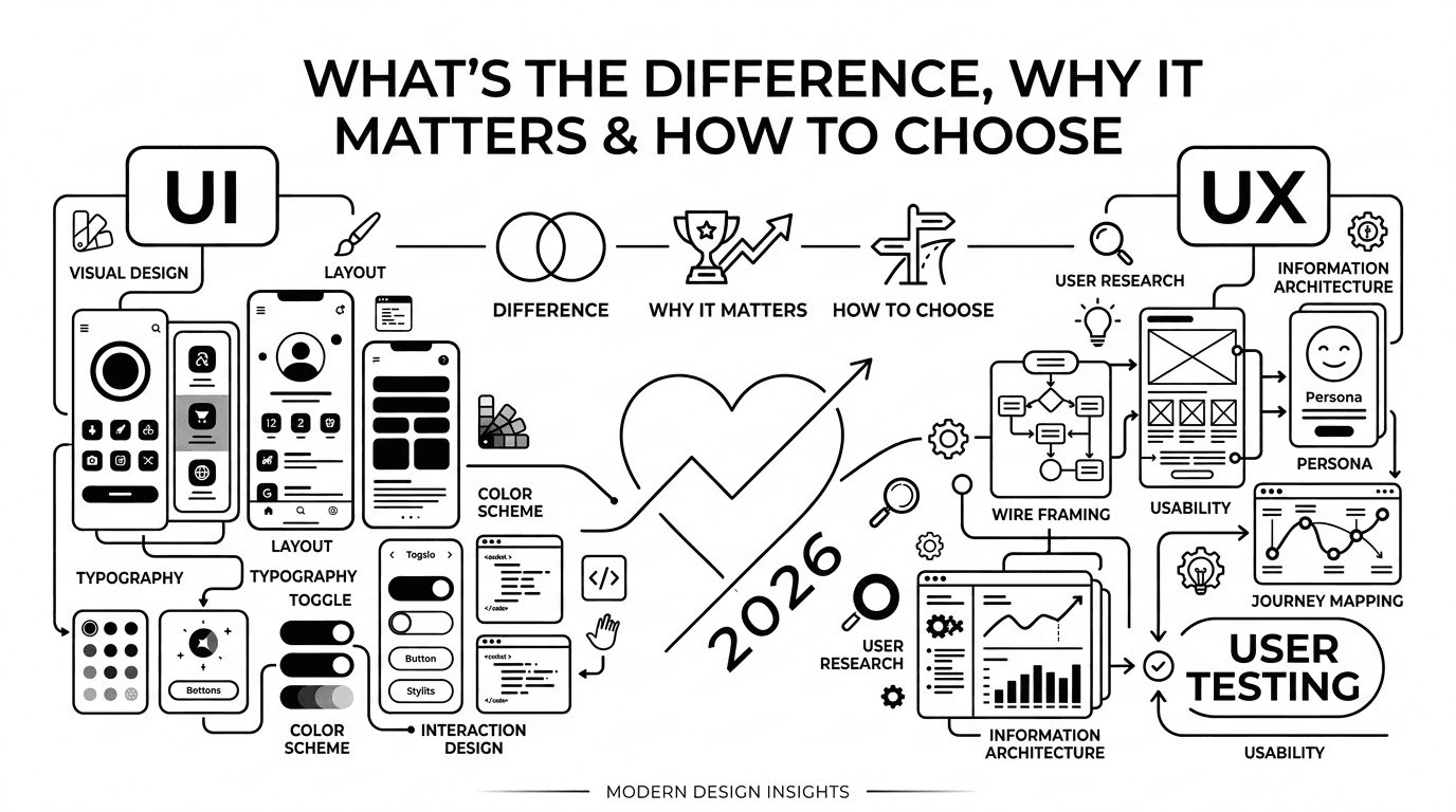
A common confusion is the difference between UI and UX. While UI(User Interface) design deals with the visual elements like colours, layouts, buttons, UX focuses on the overall experience and usability.
Why does UX matter? UX matters because it directly shapes user behaviour. A good experience keeps users engaged while poor UX leads to frustration. In real world terms, it often determines whether users stay or leave.
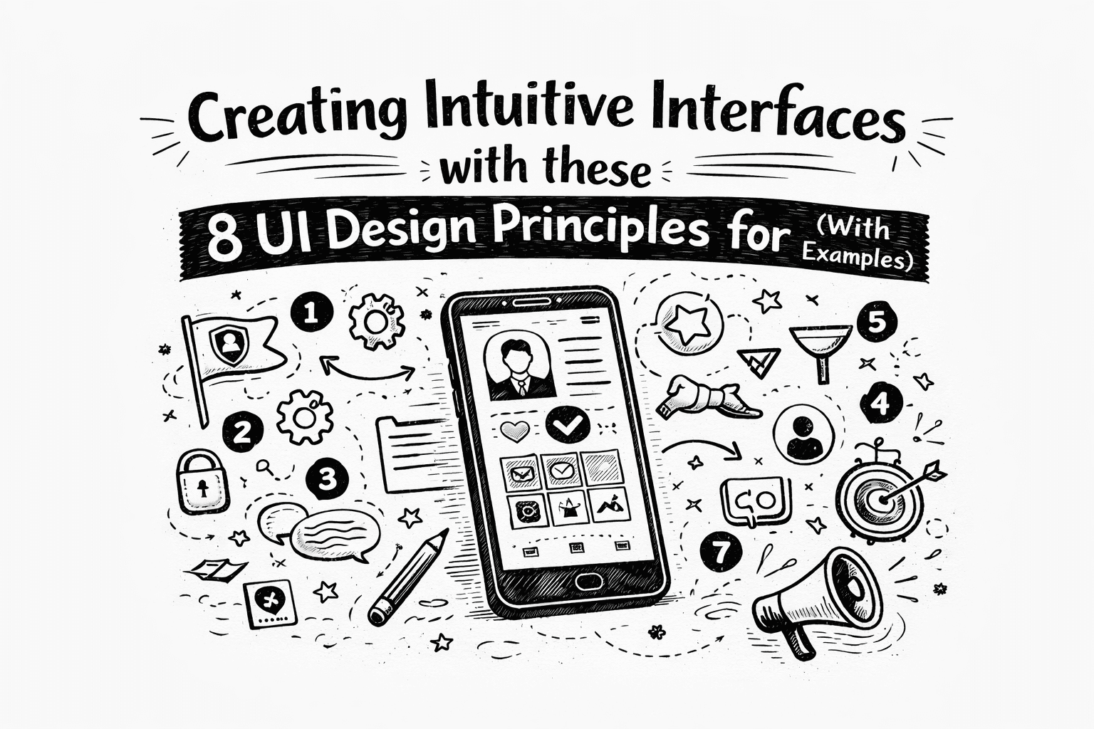
The UX Design Process- A Step-By-Step Guide for Beginners
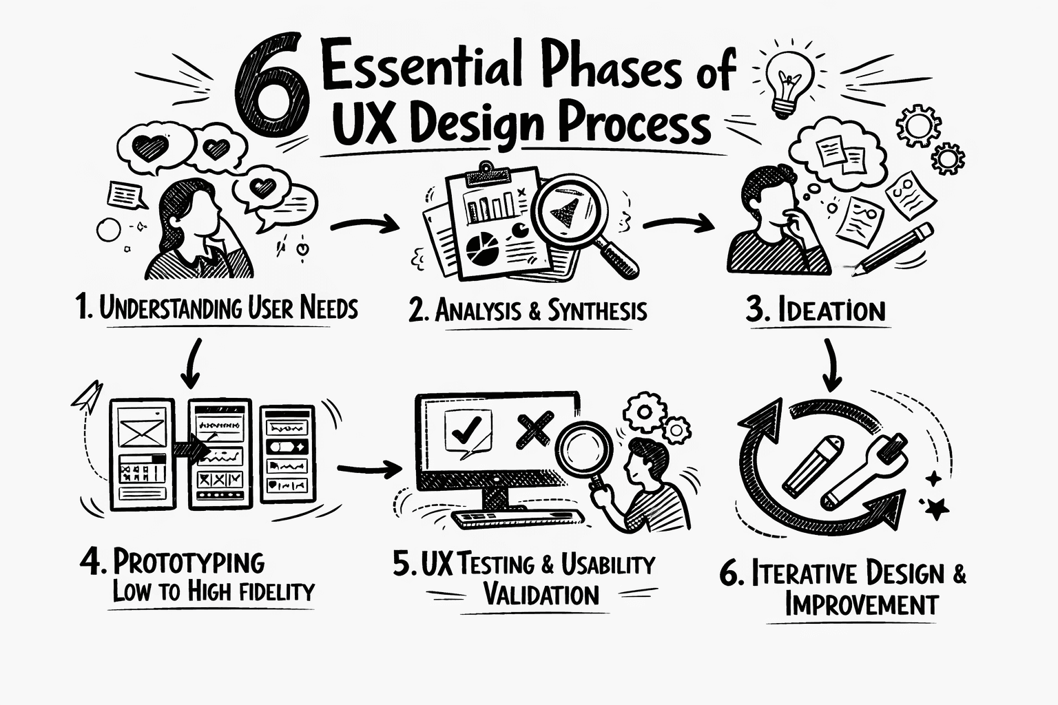
Rather than jumping straight into visuals, UX Designers follow a structured process:
Research: Understanding who your users are, what they need, and the problem they’re trying to solve. This helps you design with real users in mind, instead of making assumptions.
Wireframing: Create a basic layout of the product to plan structure and user flow, without worrying much about the colours or visuals yet.
UI Design: Turn wireframes into polished screens by using visuals like colours, typography, and interactive elements.
Testing: Observe how users interact with the design to identify areas where confusion arises, or errors happen, or the user faces usability issues.
Iteration: Refine the design based on feedback and pain points of users, making it more intuitive over time.
Now that you understand the UX process, let’s look at the tools that help bring these ideas to life.
Figma Tips for Beginners
First, what is Figma? Figma is one of the most widely used tools in the UX Design process, especially for UI/UX design workflows.
It allows designers to turn ideas into structured layouts, create interactive prototypes, and collaborate easily with others in real time. Instead of just designing static screens, Figma helps you think in terms of components, flows and user interactions.
Here are some tips that focus on practical ways beginners can work more efficiently and design with clarity.
Remove Image Backgrounds Instantly: Forget the pen tool and masking, because the Remove BG plugin does it in one click. Right-click an image → Plugins → Remove BG → Run
Copy and Paste styles in seconds: Select a styled object (color, stroke, corners, etc), and press Option+Command+C on Mac, or Ctrl+Alt+C on Windows. Then, select another object, and press Option+Command+V (Mac) or Ctrl+Alt+V (Windows) to paste all its attributes instantly. Want to copy only the colour? Use the eyedropper tool(I) instead.
Auto Layout- A core Figma productivity feature: Think of Auto Layout as the smart glue that keeps your designs flexible and organized. Instead of manually adjusting spacing every time you add or remove something, Auto layout does it for you. Select your frames or components, click + in the Auto Layout panel, and control padding, spacing, and alignment. Nest Auto Layouts inside each other for super clean, scalable designs.
Make everything a component: If you’re repeating something consistently in the design, like a button, a card or a header, make it a component. Change the main one, and all instances update automatically. Bonus: Use Variants to group similar components(like different button states) into one tidy package.
Change every instance of a font at once: If you’ve accidentally used the wrong font everywhere, just click any text box with that font, go to the Figma menu(on the top left)->Edit→ “Select All with the same font”. Then pick a new font, and it updates across your entire board instantly.
Scale objects Proportionally: Holding shift doesn’t always scale elements cleanly. Instead, hold the K key while dragging a corner to scale objects proportionally every time. It’s like a tiny shortcut that saves major frustration.
Learn these keyboard shortcuts early: While you don’t need to memorize all of these, a few can speed up your workflow dramatically.
Shift+2: Zoom to selection
Cmd/Ctrl+D- Duplicate
Cmd/Ctrl+/: Quick actions search
Cmd/Ctrl+Shift+L : Lock/Unlock layers(prevents accidental edits)
Cmd/ Ctrl+Shift+H : Show/hide layers.
8. Plugins and Community-Your Secret Weapons: Figma’s plugin ecosystem, and Community resources can save you hours. Go to plugins: Unsplash(free stock images), Iconify(thousands of icons), Content Reel(fake names, emails, avatars). You can also explore the Figma community for free templates, UI kits, and design systems you can duplicate, study, and remix.
Designing interfaces is one thing. But designing for real-world usage, especially on mobile, adds another layer of complexity.
Mobile UX practices: Designing for Real users
Mobile app usability starts with understanding how users hold and interact with their devices. Mobile UX focuses on how users feel and interact while using your app, not just what they can do. Good Mobile UX boosts satisfaction, retention, and loyalty.
The goal of mobile UX designers goes beyond the screen. You’re designing the entire experience users have before opening the app, while using it, and even after they close it.
The design should be useful, usable, desirable, findable, accessible, and credible, as outlined in Peter Morville's user experience honeycomb.
Some Helpful Mobile UX Practices:
Prioritize Simplicity over Features: One of the most common UX mistakes is cramming too much onto a single screen. A cluttered interface can overwhelm users before they can even begin. Instead, limit visible elements per screen, use clear and concise button labels, and add white space to guide the eye. An example of this would be Google Keep, which is clean, intuitive and effortless.
Don’t skip Wireframing: Jumping straight into polished mockups might feel productive, but it often leads to costly revisions later. Start with rough sketches, or low-fidelity wireframes to establish structure first. This helps you spot issues early on, test ideas quickly, and save time when the real development begins.
Keep Patterns Consistent: Mismatched icons, or inconsistent button styles force users to relearn your app every few screens. Consistency is creativity’s foundation. Users bring years of experience, and when your app works as expected, they don’t notice. And while designing UX, that should be the goal. The best interfaces fade into the background, enabling users to focus on just completing their goals. Deviate from standards only when you have a good reason to do so, not just for novelty.
Speed is also a Feature: Users may tolerate an ugly app that loads quickly, but they might abandon a stunning app that makes them wait. Speed acts like trust, where every second of loading time chips away at user patience. Compress images, minimize unnecessary code and implement caching strategies. Test your app under different network conditions, not just fast WiFi. Take Pinterest for example, where even on slow network connections, images load quickly enough to keep users engaged.
Design for Thumbs, not just the eyes: Most people use their phones one-handed, with their thumb doing all the work. Placing often-used controls at the top of the screen makes them hard to reach. Instead, use bottom navigation bars, and keep essential actions within the natural “thumb zone”. For left handed users, consider offering an optional left handed mode, or keeping key actions centered.
Test on Real Devices, not just simulators: While it might be tempting to trust Figma’s mirror mode, or a browser’s responsive view, but until you’ve tapped, swiped, or pinched on an actual phone, you may not actually get to know how your design feels. Your design will be used on screens of different sizes and orientations. It may not work everywhere just because it looks good on your design file. Test on multiple devices, check both portrait and landscape modes, and use free tools like Google’s Lighthouse, or Responsive Test Tool to catch issues early.
Declutter Your Navigation: Hidden menus and buried actions frustrate users. Keep your menu structure short and obvious. Use familiar patterns like tab bars, or bottom menus, label everything clearly, and consider a search function if your app has lots of content. The hamburger menu can be useful, but don’t hide critical actions behind too many layers.
Launch is just the Beginning: Good UX doesn’t end at launch. Watch real users inteact with your app using tools like Hotjar or UserTesting. Run A/B tests to see which button colors or layouts perform better. Look at heatmaps, notice where users hesitate, where they drop off, where they tap the wrong thing and have to go fix it again. Then, iterate based on what you learn. The best apps today got that way through continuous refinement, not perfection on day one.
Website UX Design: What makes users stay or leave
The average webpage visit lasts less than a minute. But, users don’t drift away gradually, they decide fast. Within the first 10 seconds, they’ve already made up their minds: Stay or leave, trust or bounce, engage or close the tab. So, why 10 seconds? Research on user behaviour reveals that most web pages follow a ‘negative aging’ pattern. Which means, if a user stays past the first 30 seconds, they’re likely to stay much longer.
Your job here is to prove you’re worth their time almost instantly.
7 Reasons Users Leave(and How to Fix Each One):
Slow Loading Speed: Nearly half of users expect a page to load in 2 seconds or less. After 3 seconds, 40% will start looking for alternatives, and by 10 seconds, more likely than not, they’re already on a competitor’s site. The solution? Compress images, remove render blocking scripts. Use a CDN. Test your site on a slow 3G connection, not just office Wi-FI.
Poor Navigation Structure: Complex menus, vague labels, or buried pages create friction, and friction kills conversions. The fix: Use clear, familiar terms. Limit menu items to 5-7 items. Run simple tests with someone who’s never seen your site.
Unoptimized Mobile Experience: Most of your traffic is probably on mobile. But, if your desktop design shrinks down awkwardly,(tiny texts, misaligned buttons, pinch-to-zoom frustration), then users likely won’t stay and try to adapt. They’ll most likely just leave. The fix: Design mobile-first, and then optimise for desktop. Use 44 × 44px tap targets. Keep font size at 16px or above.
Unclear or Vague Messaging: Within seconds, users need to know: What is this? Can I trust this site? Does this site have what I’m looking for? The fix: Lead with a clear, direct value proposition. Don’t make them hunt for what you do. If a friend glances at your homepage for 3 seconds and can explain what you offer, then your design was successful.
Visually Cluttered Design: Some websites contain too many colours, too many fonts, too many pop-ups, too many things competing for the user’s attention. Visual clutter creates “design paralysis”, where the user is unable to make a decision due to too many options, which becomes overwhelming. The fix: Embrace whitespace. Establish a clear visual hierarchy. One screen, one primary action. If something doesn’t have a clear purpose, then remove it from the design.
Weak or Missing Calls-to-Action: If users don’t know what to do next, they’ll just do nothing. The fix: Use action-oriented, specific language. “Get your free guide” works better than “Submit”, “Book a consultation” beats “Learn more.”
Lack of Trust Signals: Users hesitate to engage with websites that feel anonymous or unprofessional. No contact info, no testimonials, no clear authorship, all of these take away a site’s credibility. The fix is simple, add a visible “About” or “Contact” page. Include real testimonials with names and photos. And if you’re asking for personal information, explain why you need it, and how you’ll protect it.
A Practical Checklist:
Run your site through Google’s Lighthouse(free).
Watch a screen recording of a real user navigating your site(try tools like Hotjar or Microsoft Clarity)
Test on an actual phone or desktop, not just browser dev tools.
Check that your most important CTA is visible without scrolling much.
Remove distracting elements.
UX Portfolio Tips for Beginners: How to Stand Out
Your UX portfolio is the first touchpoint with recruiters, your chance to make an impactful first impression, and often the deciding factor between an interview invitation and a polite rejection.
In your portfolio, recruiters look for an insight into how you think, how you work, solve problems and whether you’d fit into their team. They may be able to train skills, but they can’t train curiosity, humility or good judgement.
Tips to stand out:
Select Two to Four Relevant Case Studies: Choose quality over quantity. Tailor your selection to each job description. If the role emphasizes research, lead with a research-heavy project. No industry experience yet? Redesign an existing product, volunteer for a non-profit, or find an internal UX opportunity at your current workplace. And instead of discarding your past career, frame it in UX terms.
Tell a Story, Not Just a Timeline: Recruiters spend 1-2 minutes on their first scan. Focus on: the problem → how you solved it(research, ideation, iterations) → the end result and key learnings.
Use Visuals to Guide the Eye: Include early sketches, research documentation, and design iterations. Use large typography or bold text to draw attention to key sections. Preview the final output early on so readers know where the story is headed.
Show Business Impact: Include metrics where possible: “Completion rates increased by 25%” or “Support tickets dropped by 40%”. Be mindful of NDAs, and anonymize sensitive details. If you can’t share exact numbers, directional language works too: “significantly reduced drop-off” or “noticeably improved task completion”.
Inject your Personality: Your portfolio likely won’t fit every job, and that’s completely okay. The goal is to appeal to the right recruiters. A generic tagline blends in, whereas specificity stands out. For example: “Designer with a background in architecture”, or “Former D1 athlete now focused on HCl”
Make it Scannable: Use descriptive project titles( not just abstract names), add short blurbs under each project on the homepage, and make your email easy to find.
Craft a Cohesive Personal Brand: Your portfolio, LinkedIn, and resume should tell the same story. It shouldn’t be static either. As you evolve, your brand evolves too. Every six months, revisit your portfolio and public profiles. Update what feels outdated, add new skills, and remove projects that no longer represent your best work.
How to Apply UX Design in Real Projects (End-to-End Workflow)
Applying UX Design isn’t just about jumping straight into pretty screens. It’s about following a structured process that starts with understanding users and ends with continuous improvement.
Here’s a real-world workflow you can apply to any project.
Understand the problem first: Figure out who you’re designing for, and what they actually need. Conduct user interviews, review existing feedback, or create a simple survey, Talk to at least 3-5 potential users. What to produce: User personas, problem statements, or a simple list of user goals and pain points.
Sketch and Wireframe the structure: Keep it low fidelity. The goal is to form a basic structure. Map out the user flow from start to finish. For example, how many screens would be the best, what happens at each step, etc. What to produce: Low-fidelity wireframes, or a flowchart showing the key paths the users will take.
Design the Interface(High-Fidelity): Bring in the visuals: Colours, typography, spacing, and interactive elements. Using Figma, or your preferred tool, turn your wireframe into polished screens. Keep your design system consistent. Reuse colours, fonts and components. What to produce: High fidelity mockups that look and feel like the real product.
Build a Clickable Prototype: A prototype lets you and others experience the flow. Connect screens using links or smart animate. Map out the key paths a user would take. At this point, don’t prototype every single interaction, just the main journeys. What to produce: A clickable prototype that simulates the real experience.
Test with Real Users: Find 3-5 people who match your target user. Watch them try to complete tasks on your prototype. Don’t guide them. Just watch, listen and take notes. Look for where they hesitate, where they misinterpret, or where they click the wrong thing.
Iterate Based on Feedback: Testing without iteration is just theater. Prioritize the biggest pain points first. Make changes. Then test again if time allows. What to produce: A refined design that actually works better for real users.
What to learn/do next, what to practice, and how to improve
UX design can indeed feel like a lot at first. All the new tools, unfamiliar processes, and a constant push to think about users before visuals. But the truth is, you don’t need to master everything as soon as you start. Start small, like a small project, or one small test. Build from there.
No one was born knowing Figma shortcuts or mobile thumb zones. They learned by doing, breaking things, and fixing them again.
Now, where to go from here:
Redesign an app screen that has always frustrated you.
Run your own website through Google’s Lighthouse and fix one issue.
Add a case study to your portfolio, even if it’s a personal project.
Follow UX designers you admire, and study how they present their work.
Let’s build something
Amazing together!
© 2025 Vimal Bhatt. All rights reserved