What is a brand kit and why is it important?
By: Vimal Bhatt

With over 3 years of experience as a UI UX designer, I’ve worked with multiple businesses and have witnessed some common branding mistakes that owners make. These mistakes often weaken their brand identity and confuse audiences. This is why a well-structured brand kit is so important in 2025.
In this blog, I’ll share some insights that I’ve gained over the years, some tips as well as a step by step guide to make your own brand kit. If you’re a designer or a business owner who is struggling to put together a brand kit, or simply need some help making oe, you can just contact me through the details below.
What is a brand kit and why is it important?
A brand kit,or a brand guideline, is a collection of all the visual and aesthetic elements that represent a brand.
It includes elements like logo, typography, the voice and tone you use to promote your brand, the colours, imagery and even the accessories you use to represent your brand.
When you are just establishing your business, or are looking to expand it, it is necessary to have a brand kit that every stakeholder in the company can refer to. When all the stakeholders work within the parameters of the brand guideline, the contents and visuals are made more cohesive and consistent.
Brands with uniform marketing and communication materials often appear more professional, stay in a customer’s memory longer, and consequently help improve brand loyalty.
To understand the importance of a well-planned brand kit, let’s look at Yahoo’s 2013 logo redesign, a rebrand that quickly became infamous. After a month-long campaign showcasing 30 different logo options in 30 days, Yahoo unveiled a final design intended to feel modern and refined. But instead of praise, the response was mostly confusion and disappointment.
Why did it miss the mark? Because the redesign lacked the support of a cohesive brand identity, a unified system of visual elements, tone, and identity. Without that foundation, the new logo felt disconnected from Yahoo’s existing brand personality.
This example shows how even large companies can get it wrong when they skip the groundwork. A strong brand kit provides the consistency, clarity, and direction needed to make bold design choices without losing the essence of the brand.
6 Thing you should defenatily include in your brand kit in 2025
When starting with a brand kit, one needs to think about the most important visual elements that represent, and can uphold the integrity of their brand across platforms and customers.
Some of the essential elements to consider when creating a brand kit are:
1. Logo Variation
A logo is a symbol or design made up of text, images, shapes, colors, or a combination of these elements, used to represent and identify a company, brand, or product.
However, one of the most common mistakes users make when designing their logo is assuming that a single logo is enough for all types of uses. It is essential to use multiple variations of a logo, like a primary logo, a simplified one, and a black and white one.
Big brands like Adidas have logo variations for every touchpoint. You can see a clear example of this in the image below.
Image showing different variation of adidas logos
2. Typography
The fonts that you use to represent your company can communicate a lot about your brand-its people, its products, or even the culture it embodies.
Fonts carry emotion. Hence,the font should match the personality and tone of the brand.
For example, Serif fonts have feet at the end which makes them look old fashioned and hence suits classic or vintage logos, sans serif font doesn’t have feet, which makes them look more modern, and can be used for modern minimalist logos. Script fonts resemble handwriting, and have a more unique and can help the business look more individualistic. Then there are display fonts which are highly stylised and are designed specifically for business.
3. Voice and Tone
A cohesive brand shouldn’t just rely on the visual elements, it should also include the voice and tone of the written content. It should be such that people can feel the message that the company is trying to convey just from its logo.
Famous established brands all have their voice. For example, the logos of some famous sports brands have been included below for reference
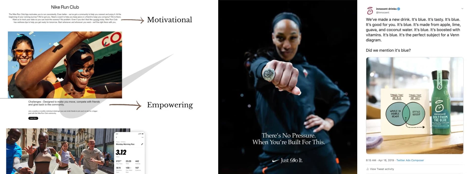
this is how big brand convey with their audience
4. Colour Palette
Colour is an important part of a brand since it can help establish a mood, attract the customer’s eye, and potentially separate it from other similar brands. When creating a brand guideline, you should select a specific set of shades that you feel reflect the brand’s personality,and then use those colours for marketing campaigns. An established set of colours also helps people working on different campaigns coordinate their colours. This helps in maintaining consistency as well.
For example, when thinking of red, in the context of a soft drink, Coca-Cola comes to mind almost immediately.

image of a coca cola drink
5. Imagery
Imagery is the use of images to represent the brand. These can include pictures, charts of graphs. More often than not, people usually use random stock photos that are not consistent with the brand image, instead of photos that are consistent with the brand identity as well as the colour palette. The images used to market a brand should feel like a real part of the brand, and should be recognisable enough that people seeing these images would immediately associate it with your brand.
6. Accessories
Accessories refer to branded physical, or digital, items that carry the brand’s visual identity, like the logo,colours, or tagline. These can include merchandise like t-shirts, mugs, pens, phone-cases and similar items that carry the brand’s logo on them. These help in subtle marketing, and can promote the brand if they’re useful and can be used frequently.
Using accessories helps in increasing brand recall and build familiarity with people since when used correctly,they become useful tools that people actually use.
Do’s and Don’ts of Brand Kit Design in 2025
Some Do’s when designing a brand guideline:
Use multiple variations of the logo that can be used on accessories,or for promoting,etc.
Stick to a colour palette consisting of 2-3 colours
Define the brand’s voice and tone and stick to it.
Use consistent imagery which is consistent with the colour palette.
Use brand accessories for reach
Use a brand kit template to stay consistent
Some Don’ts when designing a brand guideline:
Use random fonts just because they appear unique
Use trendy or bright colours that don’t go with the colour palette
Use the same logo everywhere
How long does it take to create a brand kit
Depending upon the complexity of the brand as well as the desired assets that are to be used,designing a brand kit can take anywhere from a couple of weeks to several months
Summary
Creating a brand kit in 2025 is non-negotiable if you want to build a strong, recognizable brand. While designing a brand kit or a brand guideline, from the logo variations that suit different platforms, typography that fits your brand’s personality, a consistent colour palette that suits your brand identity,the right voice and tone, to even the carefully chosen imagery, every element plays a crucial part in telling your brand’s story.
If you’re still feeling stuck, or unsure about where to begin from, contact me if you need any help bringing your brand kit idea design to life.
Let’s build something
Amazing together!
© 2025 Vimal Bhatt. All rights reserved